


The SMIL specification was introduced by the W3C in 1998 for synchronizing multimedia. This was long before CSS animations or JavaScript-based animation libraries were available. It was built into SVG 1.1, which is why we can still use it there today.
Now, you might’ve heard that SMIL is dead. However, it’s alive and well since Google reversed a decision to deprecate the technology almost a decade ago. It remains a terrific choice for designers and developers who want simple, semantic ways to add animations to their designs.
Tip: There’s now a website where you can see all my Toon Titles.
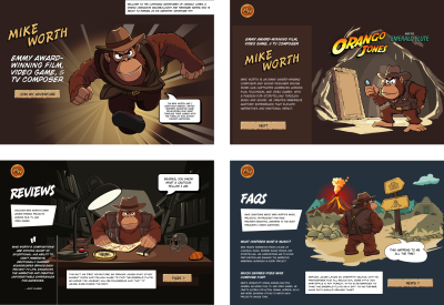
Introducing Mike Worth
I’ve recently been working on a new website for Emmy-award-winning game composer Mike Worth. He hired me to create a bold, retro-style design that showcases his work. I used animations throughout to delight and surprise his audience as they move through his website.
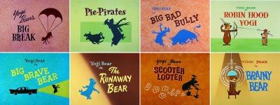
Mike loves ’90s animation — especially Disney’s Duck Tales. Unsurprisingly, my taste in cartoons stretches back a little further to Hanna-Barbera shows like Dastardly and Muttley in Their Flying Machines, Scooby-Doo, The Perils of Penelope Pitstop, Wacky Races, and, of course, The Yogi Bear Show. So, to explain how this era of animation relates to SVG, I’ll be adding SMIL animations in SVG to title cards from some classic Yogi Bear cartoons.
Fundamentally, animation changes how an element looks and where it appears over time using a few basic techniques. That might be simply shifting an element up or down, left or right, to create the appearance of motion, like Yogi Bear moving across the screen.
Rotating objects around a fixed point can create everything, from simple spinning effects to natural-looking movements of totally normal things, like a bear under a parachute falling from the sky.

Scaling makes an element grow, shrink, or stretch, which can add drama, create perspective, or simulate depth.

Changing colour and transitioning opacity can add atmosphere, create a mood, and enhance visual storytelling. Just these basic principles can create animations that attract attention and improve someone’s experience using a design.
These results are all achievable using CSS animations, but some SVG properties can’t be animated using CSS. Luckily, we can do more — and have much more fun — using SMIL animations in SVG. We can combine complex animations, move objects along paths, and control when they start, stop, and everything in between.
Animations can be embedded within any SVG element, including primitive shapes like circles, ellipses, and rectangles. They can also be encapsulated into groups, paths, and polygons:
...
Animations can also be defined outside an element, elsewhere in an SVG, and connected to it using an xlink attribute:
...
  ...
…
Building An Animation
attributeName value, it enables animations based on one or more of an element’s attributes.
Most animation explanations start by moving a primitive shape, like this exciting circle:
Using this attributeName property, I can define which of this circle’s attributes I want to animate, which, in this example, is its cx (x-axis center point) position:
On its own, this does precisely nothing until I define three more values. The from keyword specifies the circle’s initial position, to, its final position, and the dur-ation between those two positions:
If I want more precise control, I can replace from and to with a set of values separated by semicolons:
Finally, I can define how many times the animation repeats (repeatcount) and even after what period that repeating should stop (repeatdur):
Most SVG elements have attributes that can be animated. This title card from 1959’s “Brainy Bear” episode shows Yogi in a crazy scientist‘s brain experiment. Yogi’s head is under the dome, and energy radiates around him.
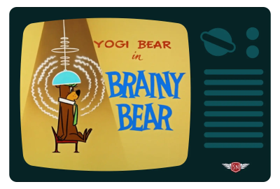
To create the buzz around Yogi, my SVG includes three path elements, each with opacity, stroke, and stroke-width attributes, which can all be animated:
I animated each path’s opacity, changing its value from 1 to .5 and back again:
Then, to radiate energy from Yogi, I specified when each animation should begin, using a different value for each path:
I’ll explain more about the begin property and how to start animations after this short commercial break.
Try this yourself:
See the Pen [Brainy Bear SVG animation [forked]]( by Andy Clarke.
To make animations appear more natural, I can apply more than one animate element and give each one a different attributename value. Those paths also contain a stroke-width attribute, which I can also animate by changing the stroke widths between 5 and 7:
Finally, I can animate the dome over Yogi’s head, changing its fill colour between two values over five seconds to create the impression that the crazy scientist’s machine is heating up:
Implement that code, and you’ll soon notice that the dome returns to its original state after the animation is complete. To retain its colour at the end of the animation, I can add the — confusingly named — fill property and a value of freeze. This stops the animation in its final state and prevents it from returning to the original colour:
Animating attributes brings these title card designs to life, whether by adjusting the position of a primitive shape, its opacity, and stroke width or by creating complex sequences with staggered timing. But there’s still more I can do, starting with the next animation element, animateTransform.
animateTransform
If animateTransform animates transformations, including rotations, scaling, skewing, and translations. It works by changing the values of a transform property, like this translate:
Then, the animation works the same way as attributename and specifying the type of transform, in this example, rotate:
I can use either from and to or the values attribute to define how an element is transformed.
- Scale uses
xandyvalues (.5,1). - Rotate uses degrees (
0–360) plus optionalxandy(360,0,0). - Translate also uses
xandyvalues (50,100). - Skew uses
xandyvalues, too (50,100).
What’s interesting about those values is that they can be added to an element’s existing values instead of replacing them. For example, when an attribute contains a translate value of 100, 0:
And then I animate that translation horizontally by 100:
Using the additive property with a value of sum, the animation values are relative to the original, starting the animation at 100 and ending at 200 by adding 100 to 100.
Similarly, if I give the accumulate property a value of sum, each instance of animation will build on the last. So, in an animation where an element is translated by 100 and repeats five times, each movement will be cumulative, moving the element by 500:
This title card from 1958’s Yogi Bear’s “Big Break” episode shows Yogi floating from the sky under a parachute.
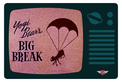
I needed two types of transform animations to generate the effect of Yogi drifting gently downwards: translate, and rotate. I first added an animatetransform element to the group, which contains Yogi and his chute. I defined his initial vertical position — 1200 off the top of the viewBox — then translated his descent to 1000 over a 15-second duration:
...
Yogi appears to fall from the sky, but the movement looks unrealistic. So, I added a second animatetransform element, this time with an indefinitely repeating +/- 5-degree rotation to swing Yogi from side to side during his descent:
Try this yourself:
See the Pen [Big Break SVG animation [forked]]( by Andy Clarke.
Starting And Stopping
So far, every animation begins as soon as the page has loaded. But there are ways to not only delay the start of animation but define precisely where it begins, using the begin property:
In this title card from 1959’s “Robin Hood Yogi”, Yogi shoots an arrow into an apple on Boo-Boo’s head.

By default, the arrow is set loose when the page loads. Blink, and you might miss it. To build some anticipation, I can begin the animation two seconds later:
Or, I can let the viewer take the shot when they click the arrow:
And I can combine the click event and a delay, all with no JavaScript, just a smattering of SMIL:
Try this yourself by clicking the arrow:
See the Pen [Robin Hood Yogi CSS animation [forked]]( by Andy Clarke.
Synchronising Animations
In his 1958 “Pie-Pirates” episode, Yogi Bear tries to steal a pie and has to outwit a bulldog. The title card — designed by Lawrence Goble — shows the chase but, alas, (spoiler alert) no stolen pie.
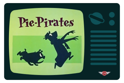
To bring this title card to life, I needed two groups of paths: one for Yogi and the other for the dog. I translated them both off the left edge of the viewBox:
  ...


  ...
Then, I applied an animatetransform element to both groups, which moves them back into view:
This sets up the action, but the effect feels flat, so I added another pair of animations that bounce both characters:
Animations can begin when a page loads, after a specified time, or when clicked. And by naming them, they can also synchronise with other animations.
I wanted Yogi to enter the frame first to build anticipation, with a short pause before other animations begin, synchronising to the moment he’s arrived. First, I added an ID to Yogi’s translate animation:
Watch out: For a reason, I can’t, for the life of me, explain why Firefox won’t begin animations with an ID when the ID contains a hyphen. This isn’t smarter than the average browser, but replacing hyphens with underscores fixes the problem.
Then, I applied a begin to his rotate animation, which starts playing a half-second after the #yogi animation ends:
I can build sophisticated sets of synchronised animations using the begin property and whether a named animation begins or ends. The bulldog chasing Yogi enters the frame two seconds after Yogi begins his entrance:
One second after the dog has caught up with Yogi, a rotate transformation makes him bounce, too:
The background rectangles whizzing past are also synchronised, this time to one second before the bulldog ends his run:
Try this yourself:
See the Pen [Pie-Pirates SVG animation [forked]]( by Andy Clarke.
The timing of this background movement is synchronised with the dog arriving, which, in turn, is relative to Yogi’s arrival, building a sequence of animations that all feel connected.
Animating Along Motion Paths
Until now, all the animations in these title cards have been up, down, left, right, or one combination or another. But there’s one more aspect of SMIL in SVG, which can add an extra dimension to animations: animating along motion paths using the animatemotion element.
animatemotion accepts all the same properties and values as animate and animateTransform, but adds a few more for finer control over direction and timing. animatemotion uses the path property to enable elements to move along a motion path. It also uses the d value for coordinate data in the same way as any conventional path.
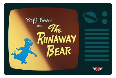
In “The Runaway Bear” from 1959, Yogi must avoid a hunter turning his head into a trophy. I wanted Yogi to leap in and out of the screen by making him follow a path. I also wanted to vary the speed of his dash: speeding up as he enters and exits, and slowing down as he passes the title text.
I first added a path property, using its coordinate data to give Yogi a route to follow, and specified a two-second duration for my animation:
Alternatively, I could add a path element, leave it visible, or prevent it from being rendered by placing it inside a defs element:
I can then reference that by using a mpath element inside my animateMotion:
I experimented with several paths before settling on the one that delivered the movement shape I was looking for:
One was too bouncy, one was too flat, but the third motion path was just right. Almost, as I also wanted to vary the speed of Yogi’s dash: speeding him up as he enters and exits and slowing him down as he passes the title text.
The keyPoints property enabled me to specify points along the motion path and then adjust the duration Yogi spends between them. To keep things simple, I defined five points between 0 and 1:
Then I added the same number of keyTimes values, separated by semicolons, to control the pacing of this animation:
Now, Yogi rushes through the first three keyPoints, slows down as he passes the title text, then speeds up again as he exits the viewBox.
Try this yourself:
See the Pen [Runaway Bear SVG animation [forked]]( by Andy Clarke.
SMIL’s Not Dead, Baby. SMIL’s Not Dead
With their ability to control transformations, animate complex motion paths, and synchronise multiple animations, SMIL animations in SVG are still powerful tools. They can bring design to life without needing a framework or relying on JavaScript. It’s compact, which makes it great for small SVG effects.
SMIL includes the begin attribute, which makes chaining animations far more intuitive than with CSS. Plus, SMIL lives inside the SVG file, making it perfect for animations that travel with an asset. So, while SMIL is not modern by today’s standards and may be a little bit niche, it can still be magical.
Don’t let the misconception that SMIL is “dead” stop you from using this fantastic tool.
Google reversed its decision to deprecate SMIL almost a decade ago, so it remains a terrific choice for designers and developers who want simple, semantic ways to add animations to their designs.
(yk)


